Best treat of boring data wrangling process is beautiful visualization that tells the whole story in single glance.
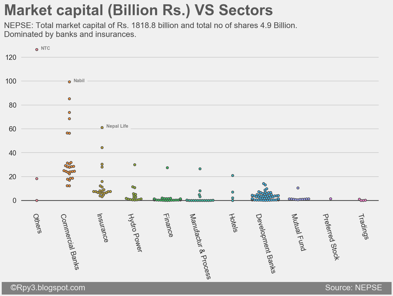
On last NEPSE tutorial, we scraped the company detail and daily stock price from 2010 to 2017. In this tutorial we will be using company detail data to make the above beautiful visualization. I have chosen swarmplot on sectors vs market capital. I like swarmplot as its gives information about distribution and number of data point on same plot.
We will be using matplotlib and seaborn packages in python.
You can download data from github/bkrmdahal/nepse.
"""Import Required packages"""
import pandas as pd
from matplotlib import pyplot as plt
import seaborn as sns
import numpy as np
import matplotlib.style as style

from util_nepse import clean_names #get if from my github nepse

#set up style
style.use('fivethirtyeight')

#read dataset
df = pd.read_csv('company_full_25_10_2017.csv')
df.columns = clean_names(list(df.columns))

#data wrangling
df['sector'] = np.where(df['sector']=='Development Bank Limited',
                                        'Development Banks',np.where(
                        df['sector']=='Manufacturing And Processing',
                                        'Manufactur & Process',
                                        df['sector']))

# change object data to float type
df['market_capitalization_rs'] = df['market_capitalization_rs'].str.replace(
                                            ',','').astype('float')/1000000000
df['total_listed_shares'] = df['total_listed_shares'].str.replace('
                                              ,','').astype('float')/1000000000
print("total market capital is ", np.sum(df['market_capitalization_rs']))
print("total_share ", np.sum(df['total_listed_shares']))

# plot  market cap vs sectors
plt.figure(figsize=(10, 5))
plt.tick_params(axis = 'both', which = 'major', labelsize = 12)
sns.swarmplot(x='sector', y='market_capitalization_rs',
              data=df, size=4, linewidth=1)
plt.xticks(rotation=-75)
plt.text(y=-75, x =-1, s = '   ©Rpy3.blogspot.com                                                                                                            Source: NEPSE   ',
    fontsize = 14, color = '#f0f0f0', backgroundcolor = 'grey')
plt.text(x = -1, y = 155, s = "Market capital (Billion Rs.) VS Sectors",
               fontsize = 26, weight = 'bold', alpha = .75)
plt.text(x = -1, y = 137,
               s = """NEPSE: Total market capital of Rs. 1818.8 billion and
         total no of shares 4.9 Billion.\nDominated by banks and insurances.""",
              fontsize = 14, alpha = .85)
plt.text(x = 0.13, y = 126, s = 'NTC', color = 'grey', fontsize = 8,
         weight = 'bold', backgroundcolor = '#f0f0f0')
plt.text(x = 1.13, y = 99, s = 'Nabil', color = 'grey', fontsize = 8,
         weight = 'bold', backgroundcolor = '#f0f0f0')
plt.text(x = 2.13, y = 61, s = 'Nepal Life', color = 'grey',  fontsize = 8,
         weight = 'bold', backgroundcolor = '#f0f0f0')
plt.axhline(y = 0, color = 'black', linewidth = 1, alpha = .5)
plt.xlabel("")
plt.ylabel("")
plt.savefig('plot.png', dpi =144, bbox_inches='tight')
plt.close()
Quote from book I am reading.
Everywhere you turn you see Americans(everyone) sacrifice their long-term interests for a short-term reward.
― Michael Lewis, Boomerang: Travels in the New Third World